
Why location changes everything in Utilities and Telecoms?
Utilities and Telecoms both run networks that exist in the real world. Assets are fixed to places, outages spread across neighbourhoods, service quality varies by terrain and density, and field teams have to travel along roads to reach sites. That makes location one of the most valuable dimensions in operational analytics.
Geospatial analytics is the practice of analysing data with a geographic context, so you can answer questions like:
- Where are incidents clustering, and why there?
- Which customers are most affected, and within what boundary?
- What is the nearest asset, depot or crew to a job?
- Where should we invest next to improve resilience or coverage?
When you bring these “where” questions into your main analytics environment ( for many organisations, Power BI ), you reduce the gap between insight and action. Maps stop being screenshots and become interactive analysis tools.
What geospatial analytics looks like in practice
At its simplest, geospatial analytics means putting points on a map. In Utilities and Telecoms, that is rarely enough. Analysis-grade geospatial work usually includes a few repeatable capabilities:
- Layering: view incidents, assets, boundaries and demand together, not in isolation
- Aggregation: summarise millions of events into meaningful clusters, hotspots or regional rollups
- Spatial relationships: understand what is inside a boundary, what is closest, what intersects, and what is upstream or downstream
- Context: add regions, service areas, pressure zones, exchanges, planned works areas, flood zones, or other operational constraints
- Interactivity: select an area and see every other visual update ( KPIs, tables, trends ), not just the map
The outcome is not “a nice map”. It is faster triage, better prioritisation, clearer communication, and more confident planning decisions.
Utilities: common questions geospatial analytics can answer
Outages and incidents: see impact, not just events
Utilities often track incidents as point events ( fault calls, alarms, customer contacts ) while impact is experienced across areas ( supply zones, feeders, postcodes, pressure zones ).
Geospatial analytics helps you:
- Identify clusters of incidents that suggest a shared root cause
- Overlay service boundaries to estimate affected customers and critical sites
- Compare incident hotspots with planned works to separate “expected” disruption from unexpected failure
- Build a clearer incident narrative for operations and customer teams: not just what happened, but where and who is affected
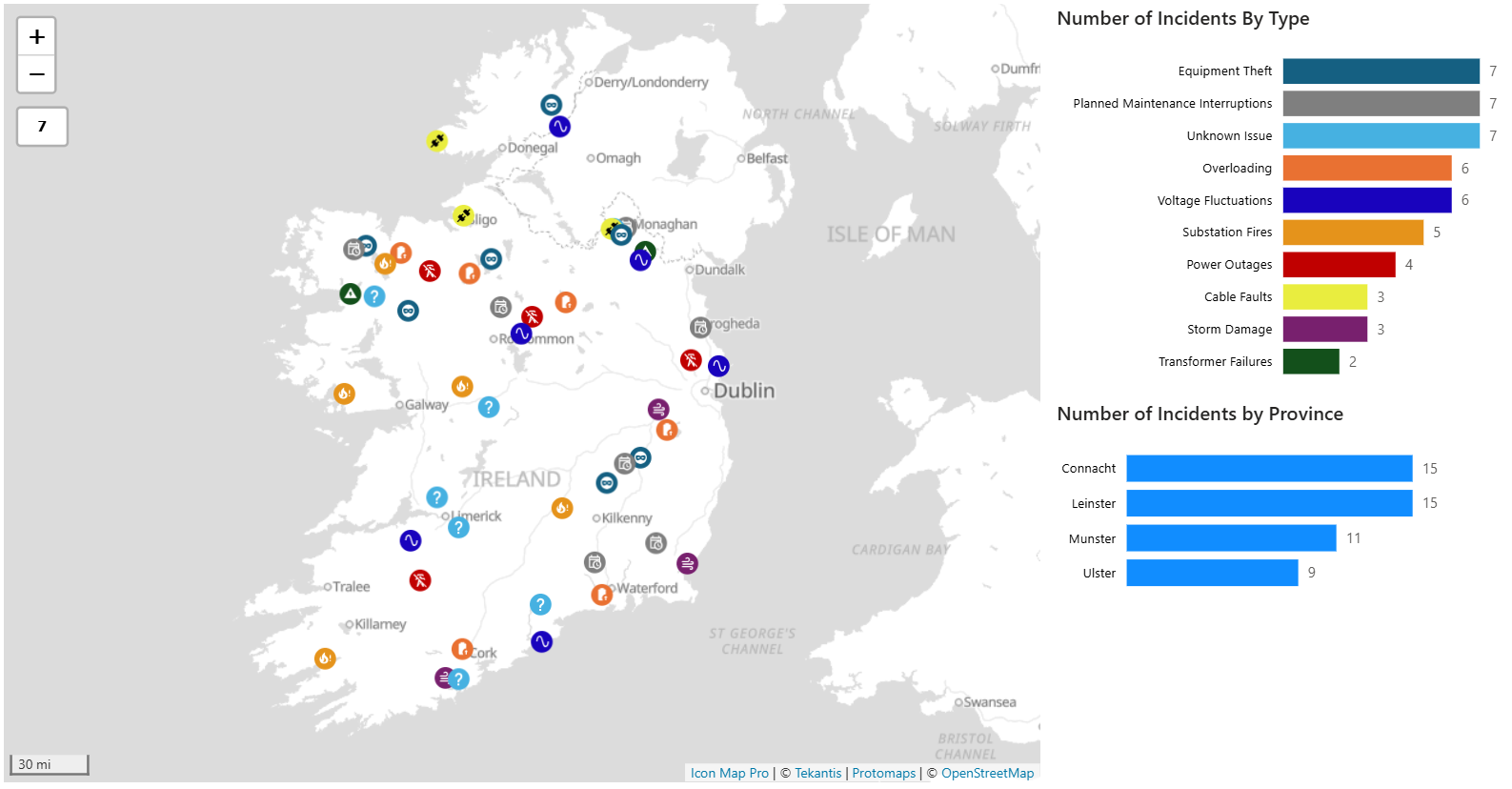
A practical pattern is to map incidents as points, service zones as polygons, and size or colour symbols by customer impact, severity or restoration stage.
The map below shows a variety of incidents across the electricity infrastructure in Ireland. To avoid map clutter, only the incidents are visible at max zoom level and as the user zooms into the map the infrastructure detail becomes visible e.g. power lines, substations, poles. The same principle can be applied to the display of service boundaries
Asset performance and risk: prioritise what matters, where it matters
Utilities asset estates are geographically distributed and often ageing. Risk is rarely uniform.
Geospatial analytics supports:
- Risk mapping ( for example, condition score by substation, pipe segment or valve group )
- Identifying repeat-failure corridors, where incidents reoccur near the same assets
- Relating failures to environmental and contextual factors such as soil type, flood exposure, tree cover, or traffic load ( where your organisation has those datasets )
- Planning inspections and renewals by proximity and grouping, so crews can do more in a shift
This is particularly valuable when combined with time: seeing how asset health and failure patterns change seasonally or after storms.
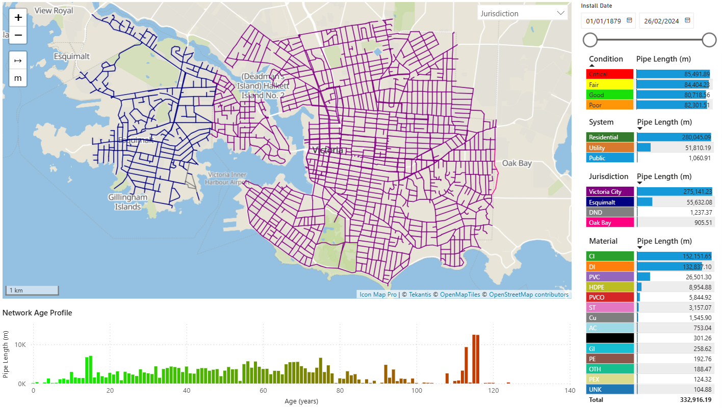
The map below shows the underground water pipes in the city of Victoria on Vancouver Island. Each pipe section is conditionally formatted, depending on the slicer selection ( condition rating, jurisdiction, pipe material etc. ) Tooltips provide further details about each pipe section e.g. condition, material, inspection log etc. The map and other page visuals charts cross-filter each other to allow a fully dynamic experience for users.
Field operations: reduce travel, improve response
For many utilities, time-to-site is a major driver of restoration performance and cost.
Spatial analysis can help:
- Balance workloads by territory and travel time, not just job counts
- Identify nearest suitable crews to a job ( based on location, skills and availability )
- Optimise planned maintenance routes by clustering jobs within practical travel boundaries
- Spot coverage gaps where depots or contractors may be needed
Even simple proximity-driven views ( nearest depot, jobs within X minutes ) can improve day-to-day decision making.
Telecoms: common questions geospatial analytics can answer
Coverage and service footprint: connect availability to customers
Telecoms coverage is inherently geographic, but the real challenge is connecting footprint to demand and experience.
Geospatial analytics enables you to:
- Compare coverage footprint with customer density and target segments
- Identify “available but under-adopted” areas where marketing and sales efforts could be better focused
- Highlight not-spots and edge-of-coverage areas where customers might technically be served but experience is inconsistent
- Track footprint changes over time and quantify how upgrades improve access
A useful pattern is to show coverage areas as polygons and overlay them with customer counts, churn risk, or take-up rates by small area.
Network performance: find hotspots and correlate causes
Network KPIs ( latency, throughput, dropped calls, complaints ) often look acceptable in aggregate and painful at street level.
Geospatial analytics helps you:
- Detect performance hotspots that are hidden by national or regional averages
- Correlate hotspots with network assets ( sites, cabinets, exchanges ), capacity constraints, or backhaul issues
- Prioritise optimisations by combining performance impact with customer volume and value
- Separate persistent issues from transient spikes by layering time filters and trend views
The key is to make location a first-class filter: select an area on the map and immediately see how KPIs, complaints and ticket volumes change.
Investment planning: decide where to build next
Build decisions are expensive and hard to reverse, so Telecoms planning benefits from bringing multiple datasets together geographically:
- Demand indicators: household growth, new developments, business parks, anchor tenants
- Competitive context: served vs unserved, quality differences (where you track this)
- Delivery constraints: wayleaves, terrain, distance to backhaul, planning complexity
- Commercial reality: expected take-up and revenue potential by area
When these are visible together, the conversation shifts from “who shouts loudest” to “what the data shows”.
Bringing geospatial analytics into Power BI without creating a GIS silo
Many organisations still treat mapping as a specialist workflow that sits outside mainstream reporting. That creates friction:
- Analysts export data to a separate tool, produce a static output, and decision makers cannot interact
- Definitions of regions and boundaries drift between teams
- Operational users have to switch between systems to answer a single question
For Power BI developers, the opportunity is to make geospatial analytics feel like a natural extension of the semantic model and report experience.
A practical approach is to:
- Model location once: standardise keys ( site ID, area ID, feeder ID ) and keep a clear geography dimension where possible
- Use boundaries consistently: operational regions, service areas, pressure zones, exchanges, maintenance areas
- Design map-driven analysis pages: the map is not decoration; it is the primary selector that drives KPIs, trends and detail tables
- Keep drill paths predictable: map selection to tooltip detail, then drillthrough to a dedicated incident/site/customer page
This is where a purpose-built mapping visual can help. Icon Map is designed to embed location intelligence directly inside Power BI so developers can build layered, interactive mapping experiences without pushing users into separate tools.
A simple “starter pattern” developers can reuse
If you are building for Utilities or Telecoms, a strong default pattern is:
One map page with:
- Layer 1: events ( faults, tickets, complaints, alarms )
- Layer 2: assets ( sites, cabinets, substations, depots )
- Layer 3: boundaries ( service areas, territories, zones )
Supporting visuals:
- KPIs ( today, last 7 days, month-to-date )
- Trends by volume and impact over time
- Detail by top assets / impacted areas
2 interaction rules:
- Selecting on the map cross-filters everything
- Drillthrough from map selection to a detail page ( incident detail, asset detail, area detail )
This provides an operational “cockpit” that works across both sectors with minimal changes to the underlying data model.
What good looks like: outcomes you can measure
When geospatial analytics is working well in Utilities and Telecoms, you will see improvements such as:
- Faster incident triage and clearer root-cause hypotheses
- Better prioritisation of field work and reduced travel waste
- More accurate communication of customer impact
- More confident investment decisions backed by transparent geography
- Fewer reporting disputes because boundaries and definitions are consistent
Next steps
If you are a Power BI developer supporting Utilities or Telecoms, start by identifying the three most common “where” questions your stakeholders ask, then build one map-driven page that answers them end-to-end.
Once you have that foundation, you can extend it with more advanced spatial patterns such as proximity-based prioritisation, boundary-driven segmentation, and further data enrichment to keep reports responsive at scale.